Does Neutral Mean Boring Spaces?
Yes, sometimes neutral is dreadfully boring BUT turn up the texture and shape to pull of a sublime space.
Okay, I need to be honest here: I am so over scrolling through Instagram and seeing neutral spaces that are just... meh. Beige-on-beige, blah-on-blah. What happened lived-in spaces with personality?
Look, I get it. Neutrals can create that calming, serene vibe. But when you take colour out of the mix, it can quickly feel like you’ve stepped into a waiting room, not a living room.
If you’re going neutral, it’s all about contrast. Play with textures, form, pattern and materials that feel rich and alive.
I’m sharing a few of my favourite pieces in warm creams, soft golds, and buttery beiges that will elevate your space. Neutral doesn’t have to mean boring. Let’s make it interesting. Here’s how!
Texture
It’s the most overlooked element yet it’s entirely essential to make a neutral room really sing. Do not underestimate how contrasting textures creates visual interest yet also gives a space that ‘je ne sais quoi’ in a room. You know, that thing that you don’t know?
A ribbed wood paneled wall, soft wool wool upholstery, smooth warm wood and soft metallic brass. The different textures all come together effortlessly because the colours are in the same tones.


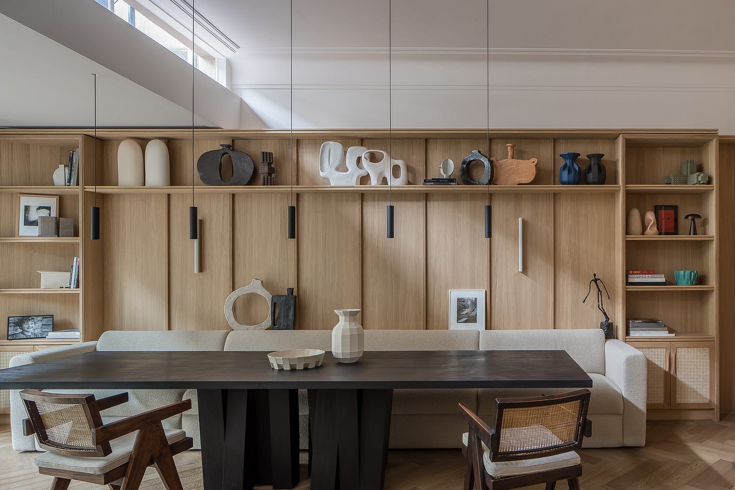
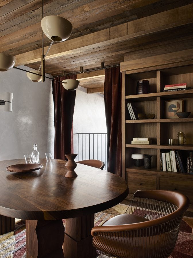
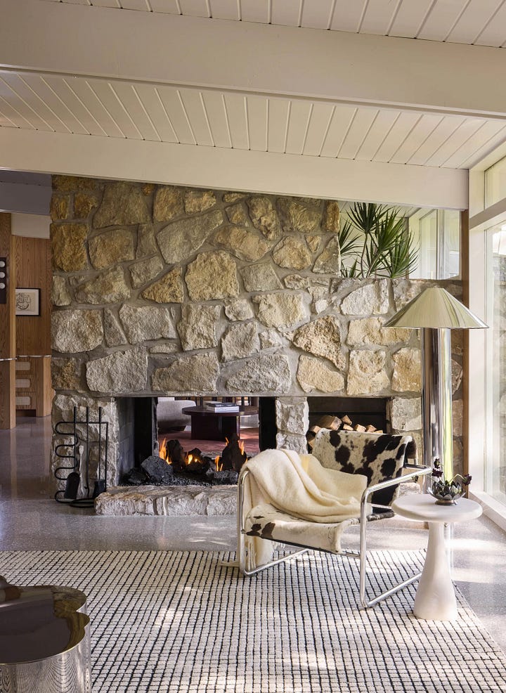
Get the Look: Texture
1. Light by Morgan Peck
2. Artwork by Caroline Walls
3. Pendant light by @pinch_london from In Good Company
4. Ottoman by @konektstudio
5. Armchair by @delaespada from In Good Company
6. Coffee table from @theinvisiblecollection
Bouclé sofa ‘Lucas’ from Castlery.
‘Nudo’ coffee table by Kelly Wearstler.
Trove Burl side table from Globewest.
Wool rug ‘Awa’ from Double.
Ceramic vessel by Emily Ellis from Pepite.
Pattern
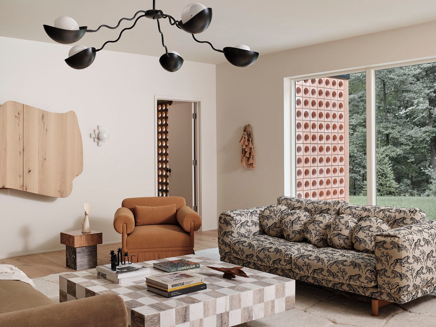
I think we’re even more scared of pattern than colour! But don’t be! Implementing one (or two) patterns in a space is truly transformative and really pays off.
A stripe is a no-brainer and an easy way to use pattern. Try introducing a patterned cushion to start with. Pattern can also be in the rug which grounds the space and ties in the colours of the room.

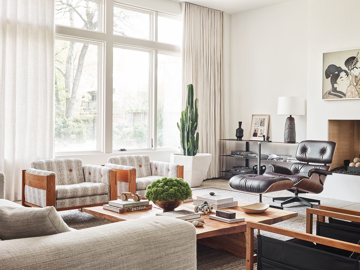
Ok, so if I’m over here yapping about interiors then what about my own place? Well here she is. The house was built in 1961 and those shelves are all built in. My sofa is a lovely warm peach colour and I see it as quite neutral however it is a ‘colour’ decision in the space. The pattern in the cushion and rug really lift the space and make it feel a little more exciting and interesting.
Here’s the details on the rug btw. Double are having 20% off right now I just noticed!


Form
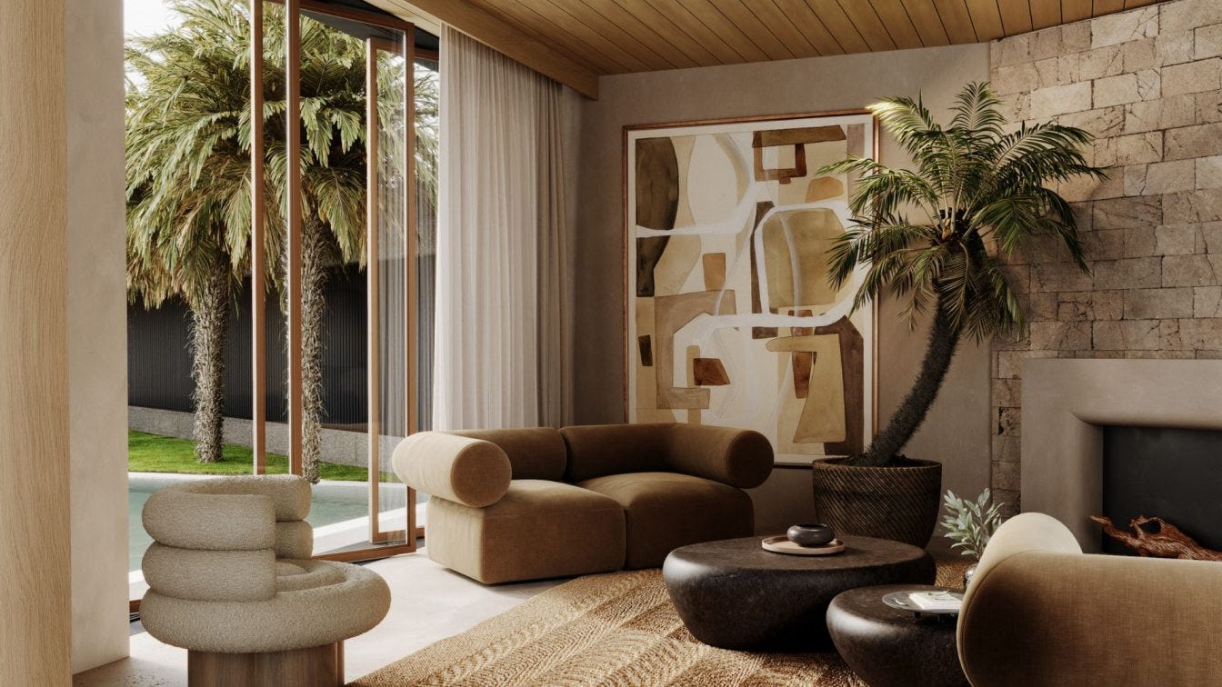
Go crazy with cool shapes! Because when a space is neutral, you need to dial up the interest factor in other ways—like form.
We’ve seen curved sofas make a huge resurgence because they add an impactful sculptural element to the space. Often the architectural lines of a room need to be broken up and softened by curves. When we take out strong colours from the equation we can mix some bold shapes together and it looks interesting and not too wild.


Get the Look: Form
I love these sculptural pieces by the talented sculptor Olive Gill-Hille.
Original artwork by Kim Bartelt from Cadogan Gallery.
Basket Armchair by Gubi from In Good Company.
Ceramic vessel by Emily Ellis from Pepite.
Sectional sofa ‘Marlow’ from Castlery.
So I hope that this guide helps see that actually, neutral spaces are NOT boring at all. Thanks for reading, till next time.
Lauren




Great article, Lauren. I feel strongly on this topic, as do you, because neutral can be beautiful when it's INTENTIONAL not the default. My focus is on no-vanilla spaces - spaces that don't follow trends but follow the heart, designed with intention... and fearlessness.